Delivered
New- and returning-customer designs
Final flows and implementation decisions are documented.
CrowdStrike · Self-service purchasing
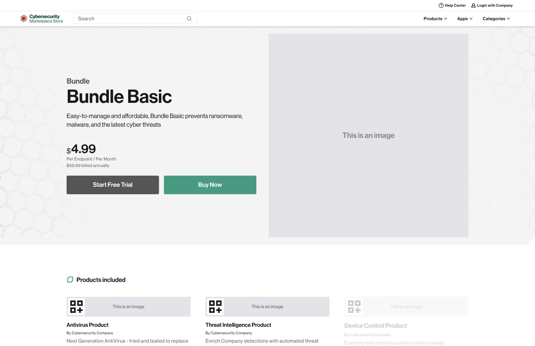
The assignment was to design a checkout, but the customer was really moving through account, payment, subscription, and order rules that had previously been handled through assisted sales. I had to make those rules understandable without making the customer learn the organization behind them.
Delivered
Final flows and implementation decisions are documented.
Resolved
Recovery and dependency decisions were included.
Not measured
Conversion, adoption, support reduction, and revenue causation are not claimed.
Business context
CrowdStrike’s enterprise sales model was built around high-touch deals. The checkout connected a marketing-led storefront to Chargebee customer and payment records so SMB customers could understand a product, create or verify an account, provide billing and payment information, and complete an order.
Service challenge
Account identity, subscription state, payment methods, product eligibility, order records, and Chargebee all shaped what a customer could do. A clean screen would not help if those dependencies produced the wrong next step.
Delivery constraints
Cart scope shifted, payment options changed, and the team was learning Chargebee’s boundaries. Two marketing teams, engineering, product, and product leadership brought different priorities, so the design had to preserve a stable sequence while individual requirements changed.
Customer states
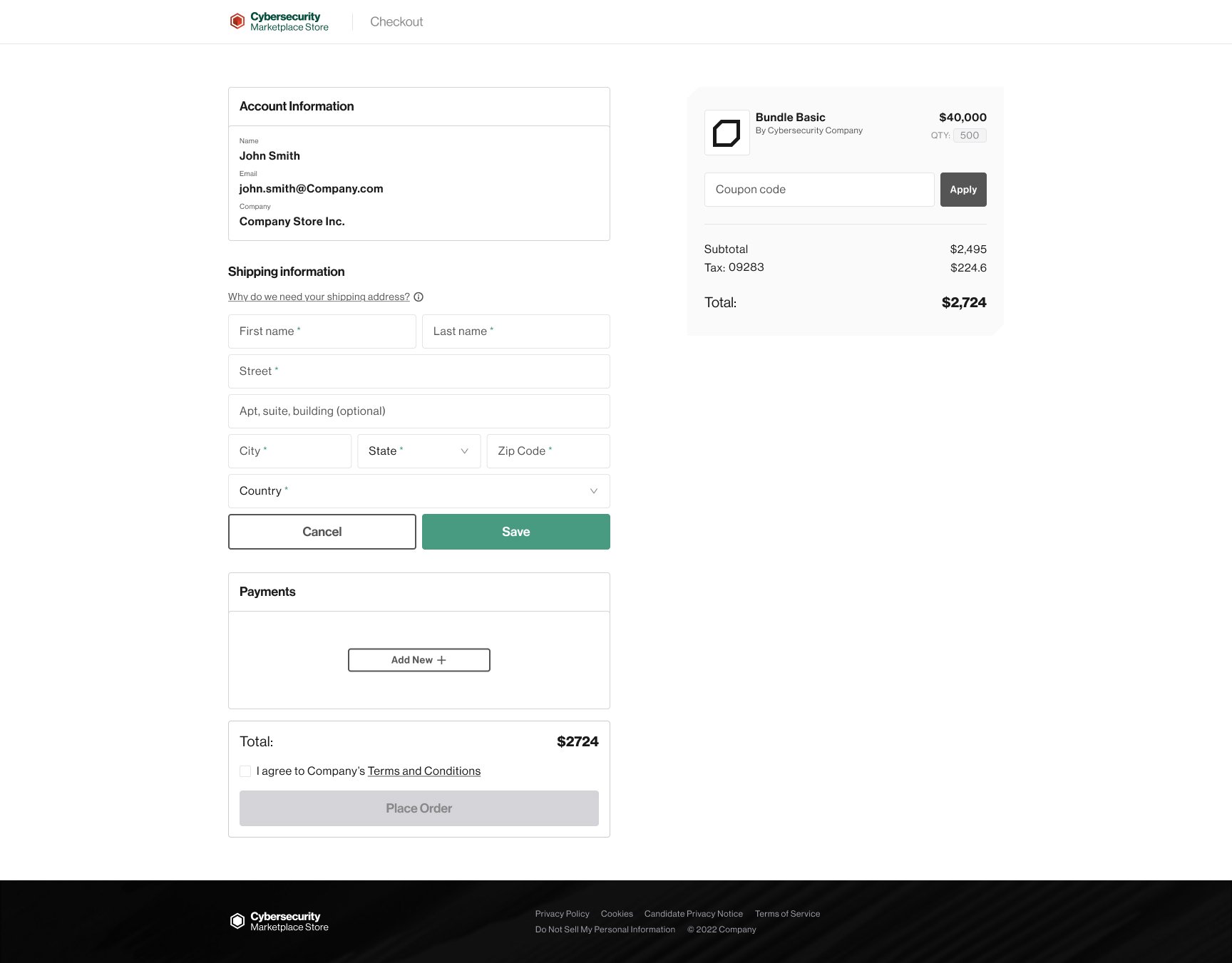
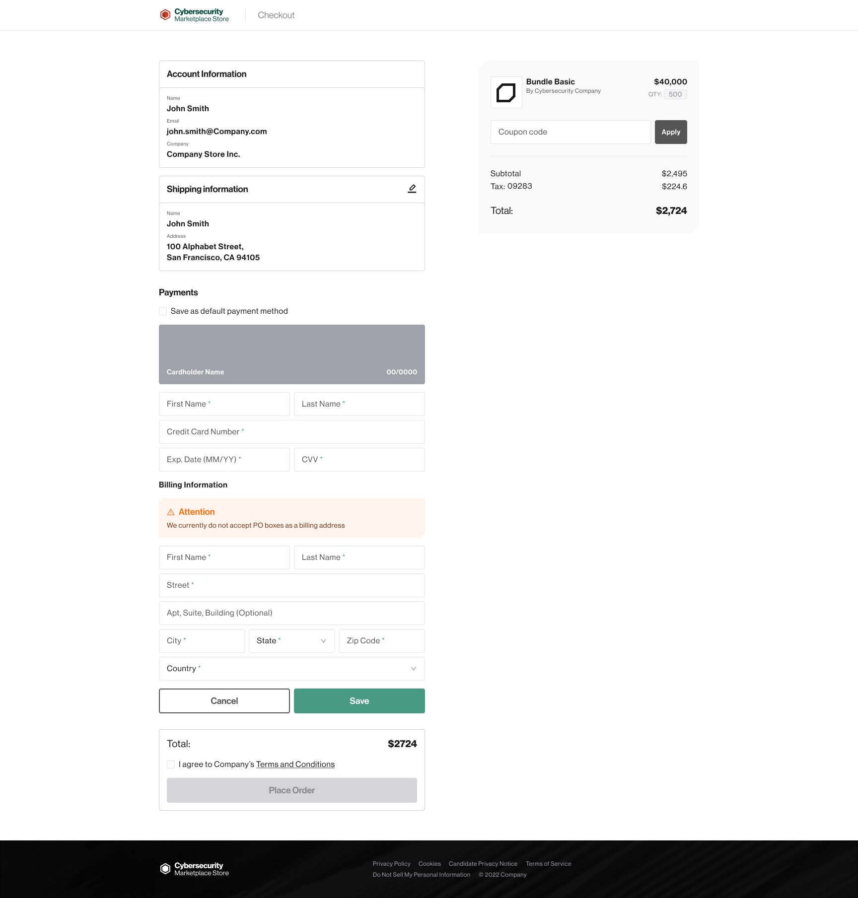
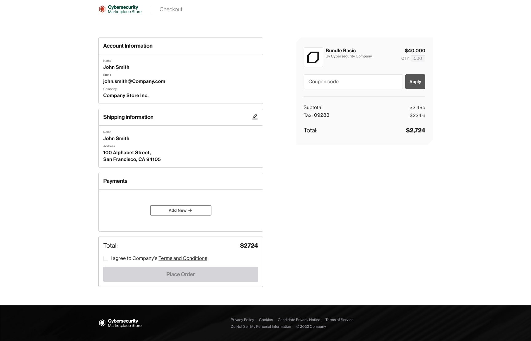
New and returning customers required different context. Missing payment methods, incomplete accounts, and existing subscriptions needed explicit recovery.


Cross-functional decision
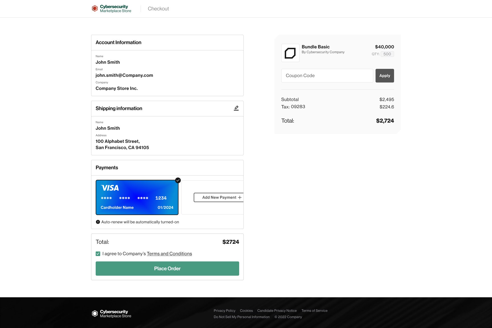
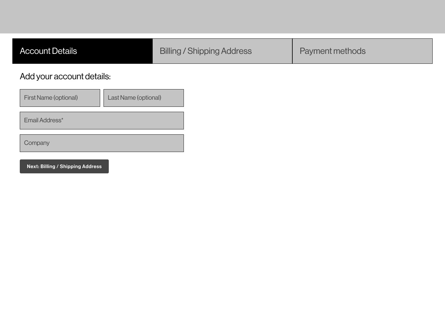
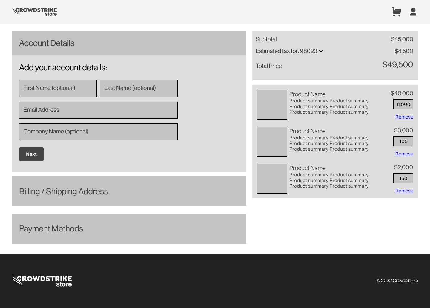
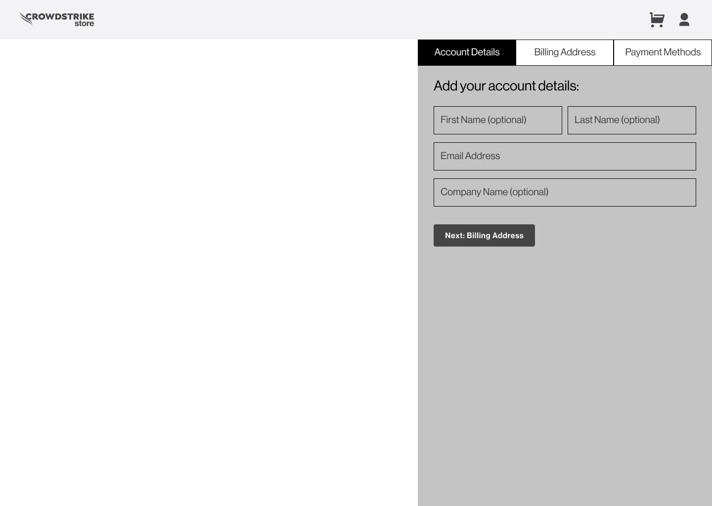
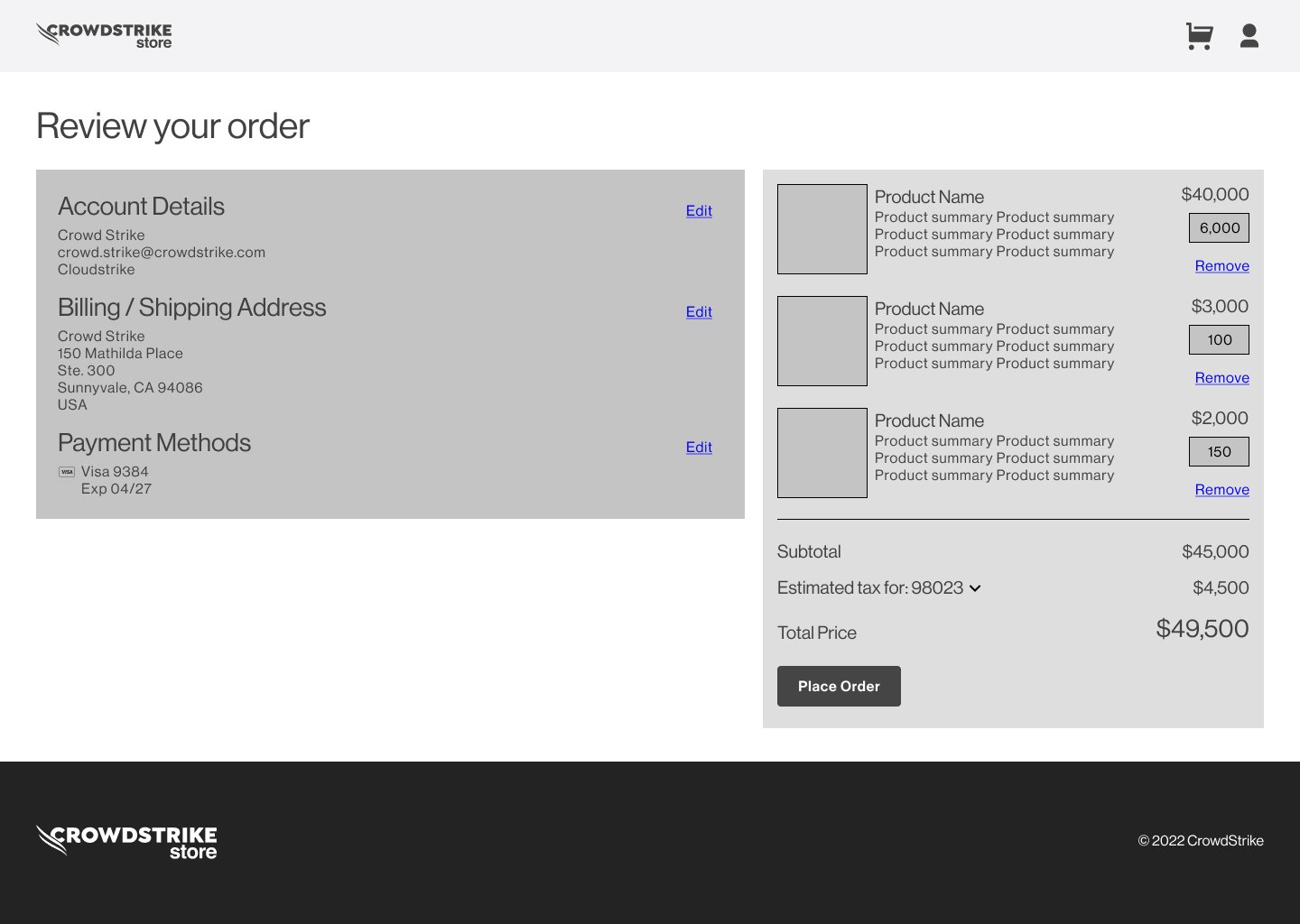
Competitive and heuristic review compared stepped, all-in-one, and sidebar directions. The team selected the all-in-one model because it kept the sequence and order context visible and could reflow naturally on mobile.
Orchestration map
The checkout was not one happy path. Customer progress depended on account, payment, and order states, with recovery interrupting the sequence when those records were missing or incomplete.
Reconstructed from preserved screen flows and project notes. It is an interpretive service-design artifact, not a record of the production Chargebee architecture.
On smaller screens, each stage is stacked for easier reading.
Tradeoff
I recommended a restrained card treatment; product leadership preferred a larger branded visual. I presented the competitive evidence and mobile implications, then carried the selected direction into the final design while preserving sequence, review, and recovery.
Validation boundary
The work included competitive and heuristic analysis, concept comparison, stakeholder reviews, and usability testing.
Outcome and limits
The delivered work included the selected all-in-one model, new- and returning-customer screens, persistent order context, missing-payment recovery, and responsive criteria.
Takeaway
The important work was translating account and payment rules into understandable states, preserving recovery, and knowing which visual tradeoffs could change without breaking the customer workflow.
Next case study